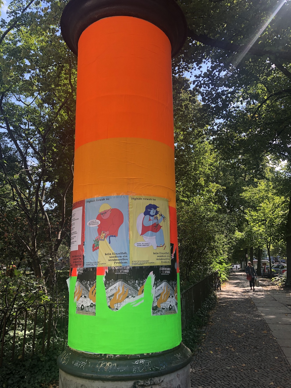
ドイツの広告は、ショックを受けたり、恐がるかもしれない人のセーフガードを付ける忖度をしない。広告はある意味「大人仕様」で、そのインパクトを広告効果へと逆手に取ってるな、と思うときもある。このポスターの好き嫌いは分かれるかもしれないけれど、とにかく目をひきつけられるし、こんなに尖がったデザインをポスターに採用するベルリンって、かっこいいなと思う。(ちなみに、サイバー攻撃の危険を訴える内容)
コミュニケーションがダイレクトなドイツは、さりげなさや控えめな表現を美徳としない。オブラートのかかっていない直球さは時にショッキングで、最初はとてもびっくりしたけれど、実際、世の中というものは汚いものも恐いものも、きれいでかわいいものと同じくらい溢れている。こっちの子供が時々に大人びて見える理由は、「大人仕様」の環境から色々と学んでいるからかもしれない。
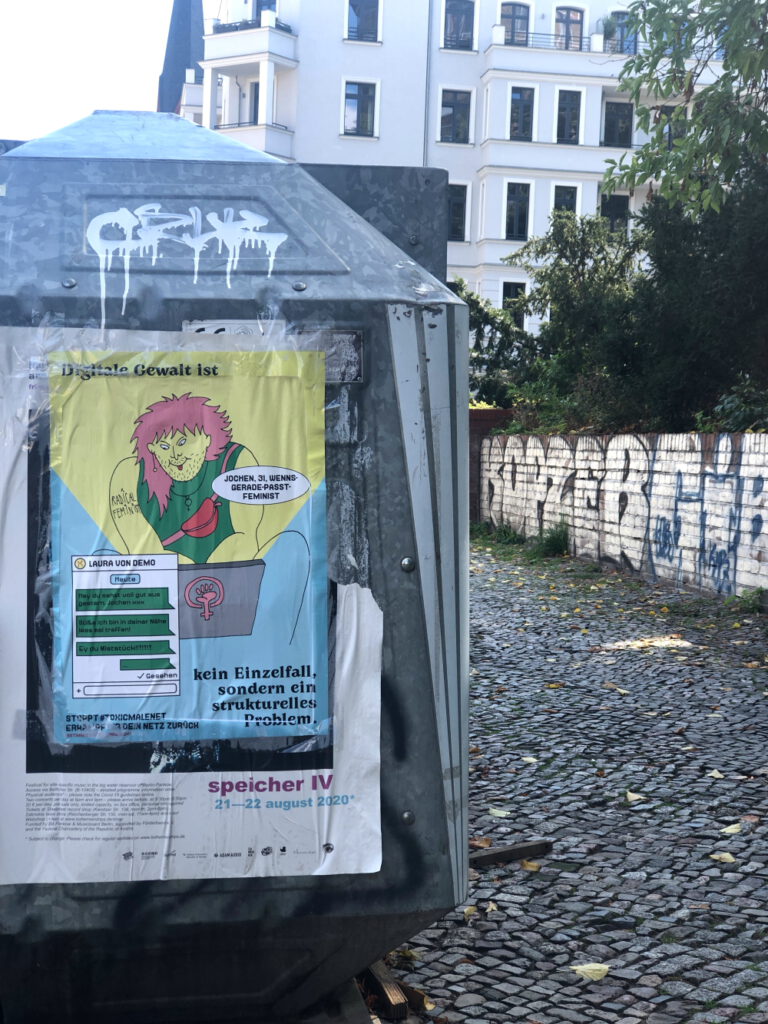
German Ads have no safeguard for a potential audience who might be scared or shocked by their expression. It is made, in a sense, “for grownups” and I sometimes think, they maybe use that impact as an effect of the Ads. Whether you like this poster or not, it catches your attention, and I personally find it cool that Berlin puts up such poster with edgy design. (By the way, this poster alarms a cyber attack)
German way of communication is direct and doesn’t seem to value subtle and unobtrusive expression, comparing to Japanese one. Their directness without any “candy-coating” is quite shocking sometimes, and I was quite surprised at first. But the world is as full of dirty and scary things as clean and pretty things. I wonder, the reason German children look grown-up for their age is maybe because they can learn what adult is from this “for grownups” Ads.
photographed in sep/2020